Terramaid vs. Overmind for Infrastructure Visualisation
Creating diagrams from Terraform configurations sounds like a great idea on paper. You want to understand your infrastructure visually, document your architecture, and help team members grasp complex relationships. Two tools approach this challenge differently: Terramaid generates static Mermaid diagrams from Terraform configs, while Overmind provides dynamic blast radius analysis with real-time dependency discovery.
The question is: which approach actually helps when your infrastructure grows beyond a handful of resources?
What is Terramaid?
Terramaid is an open-source utility that converts Terraform configurations into Mermaid diagrams. You point it at your `.tf` files, and it generates flowcharts showing resources and their dependencies. The tool aims to "enhance documentation, simplify review processes, and foster better collaboration among team members."
The basic workflow looks like this:
# Install via homebrew
brew install terramaid

# Generate diagram from current directory
terramaid run --output infrastructure.md --direction TD
The output is a Mermaid diagram that you can render in GitHub, GitLab, or any markdown-compatible viewer.
Getting started with terramaid
Setting up Terramaid is straightforward. After installation, you can customize the output with several options:
terramaid run \
--chart-type flowchart \
--direction LR \
--output my-diagram.md \
--subgraph-name "Production Infrastructure"
The tool also integrates well with CI/CD pipelines, automatically generating updated diagrams when infrastructure changes. You can even run it in Docker:
docker run -it -v $(pwd):/usr/src/terramaid rosesecurity/terramaid:latest runFor smaller Terraform projects, Terramaid produces clean, readable diagrams that clearly show resource relationships.
The reality check
Here's where things get complicated. Real-world infrastructure rarely consists of just a few resources with simple relationships. Take a typical production application with:
- CloudFront distributions with multiple origins
- ECS services connecting to RDS databases
- Load balancers routing traffic between services
- Route53 DNS records pointing to various endpoints
- Security groups, IAM roles, and S3 buckets scattered throughout
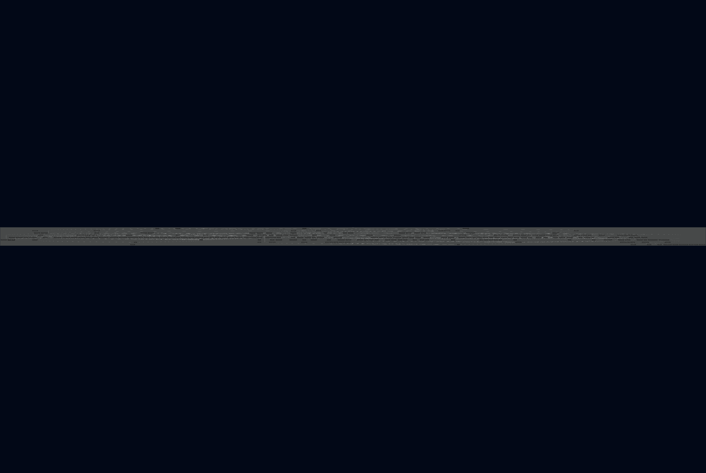
When Terramaid processes a configuration with 45+ interconnected resources, you get something that looks like abstract art rather than useful documentation. The diagram becomes an incomprehensible web of gray lines connecting boxes, with resource names overlapping and dependency paths impossible to follow.
Picture trying to trace a single request through a diagram that's literally wider than you can fit on your screen. That's the reality with complex Terraform configurations.
A different approach
Overmind takes a fundamentally different angle on infrastructure visualization. Instead of trying to diagram everything at once, it focuses on impact analysis - showing you exactly what might be affected by specific changes.
Here's how the approaches differ:
Terramaid: "Here's every resource and how they're connected"
Overmind: "Here's what could be impacted by this specific change you're making"
Overmind works by:
1. Real-time Discovery: Connects to your live AWS infrastructure to understand current relationships
2. Change Analysis: When you run `overmind terraform plan`, it identifies which resources you're modifying
3. Blast Radius Calculation: Maps out indirect dependencies that could be affected
4. Risk Assessment: Provides plain English explanations of potential issues
Getting started with Overmind
The setup is designed to integrate with your existing Terraform workflow:
# Install the CLI
brew install overmindtech/overmind/overmind-cli

# Navigate to your Terraform project
cd your-infrastructure-project

# Analyze your planned changes
overmind terraform plan
This command analyses your Terraform plan, discovers your live infrastructure, and opens an interactive web interface showing the potential impact.
What you actually get
The contrast between approaches becomes clear when dealing with complex infrastructure:
Terramaid Output:
- A massive diagram with hundreds of connection lines
- Overlapping resource names that are hard to read
- No clear hierarchy or grouping
- Static view that doesn't adapt to your current task
Overmind Output:
- Focused view on resources actually affected by your changes
- Interactive graph you can explore and filter
- Plain language risk assessments
- Real-time data reflecting your current infrastructure state
Graph view

Change View

Comparing the approaches
Let's look at a practical example. Say you're updating a security group rule in a complex application stack.
With Terramaid, you'd see the security group connected to various resources in a massive diagram, but you'd have to manually trace through dozens of connections to understand the impact.
With Overmind, you'd see specifically which ECS services, load balancers, and databases might be affected by that security group change, along with explanations like "This change could affect traffic flow to your frontend service" or "Database connections from the API service might be impacted."
The key difference: Terramaid shows you what exists, while Overmind shows you what matters for your specific change.
Where each tool works best
Terramaid excels when:
- You have relatively simple Terraform configurations (under 20 resources)
- You need static documentation for compliance or onboarding
- You want to embed diagrams in README files or documentation sites
- Your infrastructure has clear, hierarchical relationships
Overmind shines when:
- You're working with complex, interconnected infrastructure
- You need to understand the impact of specific changes before deployment
- Your resources span multiple AWS accounts or were created outside Terraform
- You want to reduce the risk of unexpected failures during deployments
The visualisation problem
Both tools highlight a fundamental challenge in infrastructure visualisation: how do you make complex systems understandable without oversimplifying them?
Terramaid's approach of "show everything" works for simple cases but breaks down as complexity increases. The resulting diagrams become beautiful but useless - technically accurate but practically incomprehensible.
Overmind's approach of "show what's relevant" acknowledges that different contexts require different views. When you're making a change, you don't need to see every resource - you need to understand what your change might break.
Conclusion
For straightforward Terraform projects with clear hierarchies, Terramaid produces valuable documentation that helps teams understand their infrastructure. The generated Mermaid diagrams integrate well with existing documentation workflows and provide a useful visual reference.
But as your infrastructure grows in complexity, static diagrams become less helpful and potentially misleading. That's where Overmind's dynamic, change-focused approach proves its value. Instead of trying to visualise everything, it helps you understand what actually matters for the task at hand.
The choice depends on your specific needs:
- Documentation-focused teams working with moderate complexity should explore Terramaid
- Operations-focused teams dealing with complex, multi-service infrastructures will find more value in Overmind's impact analysis approach
Both tools are actively developed and free to try:
- Terramaid: GitHub repository with installation instructions
- Overmind: Sign up for free to try the impact analysis
The real insight isn't choosing between visualisation approaches - it's understanding that different infrastructure challenges need different tools.