Redesigned UI [PREVIEW]
Our team has been busy with fully redesigning the entire app with a cleaner layout, improved navigation, and more consistent visual patterns throughout the experience.
The interface now features clearer layouts, refined typography, and more intuitive navigation, making it easier to move through pages and understand what’s happening at a glance.
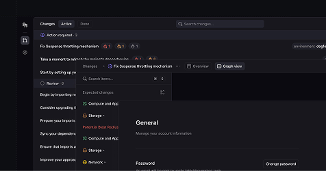
Furthermore, components have been rebuilt for greater consistency, pages load with less visual noise, and interactive elements now feel more responsive.
Altogether, the new design makes Overmind faster to understand, easier to use, more enjoyable to navigate, andmarks a major milestone in our evolution toward becoming the industry standard.
You can try it our for free by signing up.
Bug Fixes
— Issue where an empty paragraph element was rendered in inside the change overview
— Duplicated change risks
Improvements
— More consistent loading states
— More consistent popover animations
— Contrast issue when code was mentioned inside the Assistant in dark mode