Tools to Visualise your Terraform Plan
Introduction
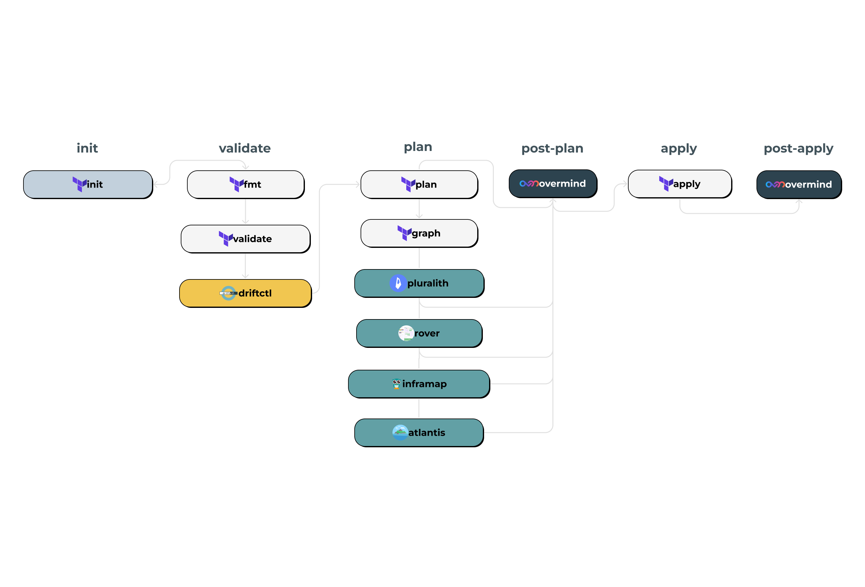
When working with large or complex Terraform configurations, it can be a challenge to both understand and visualise the resulting infrastructure changes. This is where tools for visualising Terraform come in, enabling DevOps and CloudOps teams to gain valuable insights into their infrastructure deployments. In this article, we’ll explore the tools available and how they can add value to your infrastructure management workflow.
Here is the full list of tools explored in this blog:
Please note: If there's any other Terraform visualisation tools you would like to see added, please drop us an email or message in our Discord and we’d love to give it a try and add it to this article.

The validation stage is where you check the syntax of any Terraform changes before running a plan. It is also where you can look to check for any configuration drift.
Terraform fmt: Is a command that automatically reformats Terraform configuration files to a consistent and canonical style, making the code easier to read and maintain.
Terraform validate: Is a command that checks the syntax and basic structure of a Terraform configuration to ensure that it is valid, without actually applying any changes to the infrastructure.
.png)
Managed by Snyk, Driftctl is an open-source tool designed specifically for cloud and Terraform deployments. Driftctl can be viewed as a drift monitoring tool which needs to run continuously to detect new drifts. It scans your infrastructure and compares your Terraform state files against the cloud provider APIs for unexpected modifications.
Any drift will be highlighted and then it will be up to you to decide what to do about it. Driftctl is unable to make these updates itself as it only requires read-only access.
It is worth noting though as of June 2023, Snyk R&D will no longer provide community support for driftctl. Driftctl will still be available as an open source project but there is no promise to review contributions.
Usage
Driftctl is available on Linux, macOS and Windows. Further detailed info on installation can be found here.
You will need to assign proper permissions to allow driftctl to scan your account. Below is an example of configured AWS credentials. Further instructions for the different providers can be found in the docs.
# To specify AWS credentials
$ AWS_ACCESS_KEY_ID=XXX AWS_SECRET_ACCESS_KEY=XXX driftctl scan
# or using a named profile
$ AWS_PROFILE=profile_name driftctl scan
The scan command scans resources from the input Terraform statefile and compare it to your current profile infrastructure.
# With a local state$ driftctl scan
# Same as
$ driftctl scan --from tfstate://terraform.tfstate
# With state stored on a s3 backend
$ driftctl scan --from tfstate+s3://my-bucket/path/to/state.tfstate
The example below is outputted in HTML and viewed in a browser. From the report you are able to clearly see all AWS resources that are not yet in the Terraform state.

.png)
When using Terraform the output from terraform plan can be used to help understand the impact your infrastructure changes. Terraform has terraform graph to help visualise these changes however when dealing with large or complex infrastructures this can quickly become difficult to navigate. In the cases of Reddit and Loom; large, complex changes contained small configuration errors that were missed by humans reviewing and ultimately caused critical downtime. Because of this several solutions have emerged both open source and enterprise to help with the reviewing and visualising when making Terraform changes.
Comparisons
As we have more than one tool available for visualising a Terraform plan output it makes sense to do a comparison of their features and of their usage on a example change. To provide some context to the application change we will be using for the comparison. It is a change that effects a Kubernetes cluster that manages some API gateways using AWS services such as EKS, EFS & Route53. The size of the repo we will be using is ~4400 line.

The terraform graph command is used to generate a visual representation of either a configuration or execution plan. The output is in the DOT format, which can then be used to generate charts. The recommended program that can read this format is GraphViz, but many web services are also available to read this format. Some add extra formatting to the outputs so that they are easier to read.
Here are some of the online services:
- http://www.webgraphviz.com/
- https://dreampuf.github.io/GraphvizOnline/
- https://github.com/mdaines/viz.js → emscripten → http://viz-js.com/
- Using WASM port in ObservableHQ
- https://sketchviz.com/new
Results
Let’s take a look at what our example change would look like as a Terraform Graph output. Due to image dimension restrictions the below is a screenshot of a much larger Terraform Graph output. In this example the output was a 3.5mb svg file or a image with the dimensions 256925px by 3802px.
If you were to convert pixels to cm's it's about as it's about as wide as The Wingspan of a 747 (68 metres). Dealing with such a large file is not easy and as you can see from the above screenshot it is not easily readable. However, Terraform graph can still be a great tool when working with smaller, more manageable changes or if you simply want something to run on CLI. Before running this comparison we didn't consider our Terraform repo to be particularly large at ~4400 lines but maybe it is. If your repo is this size or larger expect trouble with many visualisation tools.
.png)
.png)
Rover is a open source interactive Terraform Plan visualiser that helps users explore their state and configuration and runs locally on your machine.
Rover uses a plan file to generate the state so in addition to visualising the current infrastructure state, you're able to view any changes to the resources (creation, modification, or deletion).
Usage
Rover does this by:
- Generating a plan file and parsing the configuration in the user’s root directory.
- Parsing the plan and configuration files to generate three items: the resource overview, the resource map, and the resource graph.
- Rover then consumes the RSO, map, and graph to generate an interactive configuration and state visualisation hosted on localhost:9000
The quickest way to get up and running with Rover is by using Docker.
Run the following command in any Terraform workspace to generate a visualisation. This command copies all the files in your current directory to the Rover container and exposes port :9000
docker run --rm -it -p 9000:9000 -v $(pwd)/plan.json:/src/plan.json im2nguyen/rover:latest -planJSONPath=plan.jsonOnce Rover is running on localhost:9000, navigate to it in a browser to find the visualisation.
From here you can then explore the visualisation of your terraform plan output. The legend on the left hand side shows you the different categorisations of resources and other items. With Rover you are able to export the generated graph as .SVG file.
Results
Rover does a great job at visually showing you the output of your Terraform plan. You can interactive with the graph within your browser making navigation easier than just dealing with a image.
The browser contains a handy key that helps you to understand the various colours and what is going on. However it can still be quite complex to understand the various links with larger plan outputs because of the formatting of the graph. Rendering the graph was troublesome due to its sheer size and complexity and required trying a few different browsers. The resulting file was also 18mb png which required some compressing to fit into this article and may pose challenges if sharing internally or over email. If you've got less terraform than us (~4400 lines) this likely won't be a problem.

.png)
InfraMap can read your tfstate or HCL to generate a graph specific for each provider, showing only the resources that are most important/relevant. It supports AWS, Flexible Engine, GCP, Azure and Openstack resources.
InfraMap can be run from the command line or included in an existing project. It can generate anonymised graphs and allows full visibility of cloud resources.
Usage
To install the latest release of InfraMap, you can pick one of these methods:
- Pull the latest release from the Releases page
- Pull the latest docker image from the Docker hub
- Use your Linux package manager (only AUR at the moment)
Inframap offers several different commands based on your desired output format (dot, grapheasy.) All you need is TF state file to run the command against.
inframap generate {tf_state_file} | dot -Tpng > graph.png
inframap generate {tf_state_file} --raw | dot -Tpng > inframapraw.png
Results
InfraMap works great at creating diagrams quickly in a single command. Using different commands you can change the diagram output. Inframap does this by having a static list of resources that can be nodes or edges. Once the edges are identified, it tries to create one unique edge from the resources they connect giving you the much simplified diagram below. Although it is simpler it does impact the usability of it as it is missing a lot of resources and dependencies that are there in the other tools (Rover, Pluralith.)


It also runs into the same problems as TF graph when using the --raw option due to the size of the plan. The resulting output was auto scaled which meant it was not readable.
.png)
Pluralith is a tool that enables Terraform users to visualise changes to infrastructure state in a graph based on state files. Pluralith runs terraform plan under the hood to get data to visualise. It then generates a diagram which is posted as a pull request comment that contains drift highlighting and cost information via Infracost.
It also has a dashboard that gives you a visual history of all your Terraform plans. It support AWS at this moment but other providers are on the roadmap. Currently Pluralith offers two plans, a free plan that allows you to run it locally and a paid plan that allows you to integrate it into your CI/CD pipeline (Github, Gitlab and Terraform Cloud/Enterprise.)
Usage
To install Pluralith locally (free tier), you can download and install the open-source Pluralith CLI. To use it make sure to add it to your PATH.
Next you'll need to set your credentials for communication with the Pluralith dashboard and API. You can find the API Key in the dashboard user settings.
pluralith login --api-key $PLURALITH_API_KEYNow you are all set to run pluralith graph in the project of your choice to instantly generate a diagram that is then stored in the dashboard. However if you would like to generate the graph locally the
graph command also supports headless generation of diagrams as a PDF.
pluralith graph
pluralith graph --local-only
Pluralith also integrates with Infracost which can provide cost estimations on your changes. You are required to have a license and then setup with your API key. Once set up you can run.
inframap generate tf_state_file | dot -Tpng > graph.png
inframap generate tf_state_file --raw | dot -Tpng > inframapraw.png
Results
Pluralith provides a clear diagram with the relationships of the different services that make up our application. The diagram was very easy to navigate due to its structure and use of icons.
However, at the time of writing this, we were only able to generate a graph locally due to a 400 error. Doing some research this could be because the file size is too large due to our repo being fairly sizeable at ~4400 lines. Although the locally generated PDF is great for visualisation of your infrastructure, the functionality to see what is being impacted lives within the dashboard. With that aside, it still provided what we would say the best graph out of the tools we compared.

.png)
Atlantis is an open-source, self-hosted automation Terraform application. It operates based on pull requests and simplifies the Terraform workflow by automating tasks through pull request comments.
With each new pull request, Atlantis automatically executes the terraform plan command and provides feedback by commenting on the pull request.
Once the suggested changes are reviewed, users can leave comments in the pull request to apply those changes. When you want to apply, comment 'atlantis apply' on the pull request and Atlantis will run terraform apply and comment back with the output. A successful apply will automatically merge the pull request.
Atlantis is self-hosted which means your credentials don’t leave your infrastructure. It listens for webhooks from GitHub/GitLab/Bitbucket/Azure DevOps and runs terraform commands remotely and comments back with their output.
Usage
There are multiple ways to deploy Atlantis. It can run as a Golang binary or Docker image and can be deployed on VMs, Kubernetes, Fargate, etc. For example if you want to deploy via Kubernetes you can find the official Helm Chart here.
The next thing is configuring permissions for Github. You can further information about how to do that here.
There are two configs that are required for Atlantis. The first configuration is called a Repo Level atlantis.yaml config which is responsible for enabling autoplan. This configuration should exist in the root of your Terraform repo.
The second configuration you’ll need is known as the Server Side Config. This config is where we’ll define what actually happens when you push code to Github (plan/apply) and any steps we want to run pre, or post plan/apply.
Results
Atlantis formats your plan output making it easier for you to consume and make decisions on compared to the standard Terraform plan output. The highlighting makes it much easier to look over in a glance, particularly if you are running multiple runs a day. Although it does not visualise your plan in a graph form like the others as it is primarily a automation tool you could add them in as part of the CI/CD run.

.png)
The post-plan stage executes any configured run tasks after the plan is complete.
The apply stage in Terraform is the stage where the changes to the infrastructure are actually applied.
Although there is no specific post-apply stage in Terraform it can still be configured in a CI/CD pipeline to provide some feedback after the apply stage.
.png)
Unlike the visualisation tools covered above, Overmind takes a different approach to understanding Terraform changes.
Rather than focusing solely on generating visual representations, Overmind combines real-time infrastructure analysis with risk assessment to help teams understand not just what will change, but whether those changes are safe to deploy.
How it works
Overmind operates by analyzing your Terraform plan output alongside the current state of your infrastructure.
Using read-only access to your AWS account, it queries your infrastructure in real-time through the AWS API to build a complete dependency map that includes resources created outside of Terraform - whether through the console, CloudFormation, or other tools.
The process works as follows:
- Run `
overmind terraform plan`in your Terraform workspace - Overmind analyses the plan and queries your live infrastructure
- It maps dependencies across 100+ AWS resource types and Kubernetes objects to create the changes blast radius
- Using this dependency map (blast radius) and pattern analysis, it identifies potential risks
- Results are provided as human-readable risk assessments
Installation and Setup
Installing Overmind CLI is straightforward:
To install on Mac with homebrew use:
brew install overmindtech/overmind/overmind-cliInstall using winget:
winget install Overmind.OvermindCLIOr find other installation methods here.
Next run `overmind terraform plan` in your Terraform workspace and you'll need to configure read only access to your
AWS / K8s access along with creating an Overmind account.
Example
When running against our example Overmind Terraform Repository, this change attaches the AdministratorAccess IAM policy to the terraform-example IAM role, granting it full control over AWS resources.
Change View

Blast Radius Graph

Key Differences
Where traditional visualisation tools show you the structure of your changes, Overmind adds context about the safety and timing of those changes. It addresses several common challenges:
- Hidden Dependencies: Discovers relationships that don't exist in your Terraform state
- Timing Awareness: Considers when changes are being made (peak hours vs. maintenance windows)
- Cross-Account Resources: Maps dependencies across multiple AWS accounts
- Historical Patterns: Learns from previous deployments to identify risky patterns
Integration Options
Overmind can be integrated into existing workflows through:
- GitHub Actions for automatic PR comments
- GitLab CI integration
- Direct CLI usage in any CI/CD pipeline
- Terraform Enterprise/Cloud run tasks
The tool provides risk information where teams need it most, during code review and before applying changes. This approach helps teams move beyond asking "what will change?" to understanding "is it safe to change this now?"
Github Comment

When to Use Overmind
Overmind is particularly useful when:
- Your infrastructure includes resources created outside Terraform
- You need to understand cross-service dependencies
- Team members have varying levels of infrastructure knowledge
- You want to reduce reliance on "tribal knowledge" for safe deployments
- Deployment timing matters for your application availability
By combining dependency mapping with risk analysis, Overmind helps teams make more informed decisions about when and how to deploy infrastructure changes, reducing the likelihood of unexpected outages from seemingly simple modifications.
Summary
We hope you find this article helpful in showing you some of the tools out there today for visualising your Terraform plan. As we said at the start if there's any other Terraform visualisation tools you would like to see added, please drop us an email or message in our Discord and we’d love to try them.
You can find the full list of all tools here: